

by Katie Paige, on February 7, 2017
Pie charts have historically been one of the most widely used displays for data visualization. However, you'll find they're often the butt of jokes and the subject of articles like …
Read Storyby Jessica Dugas, on December 1, 2016
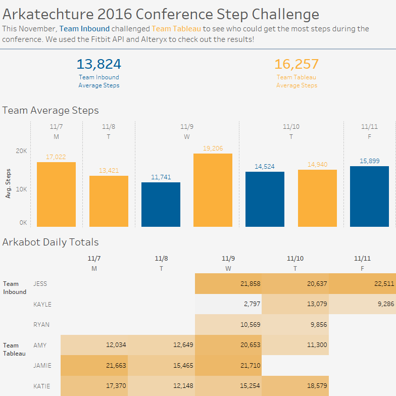
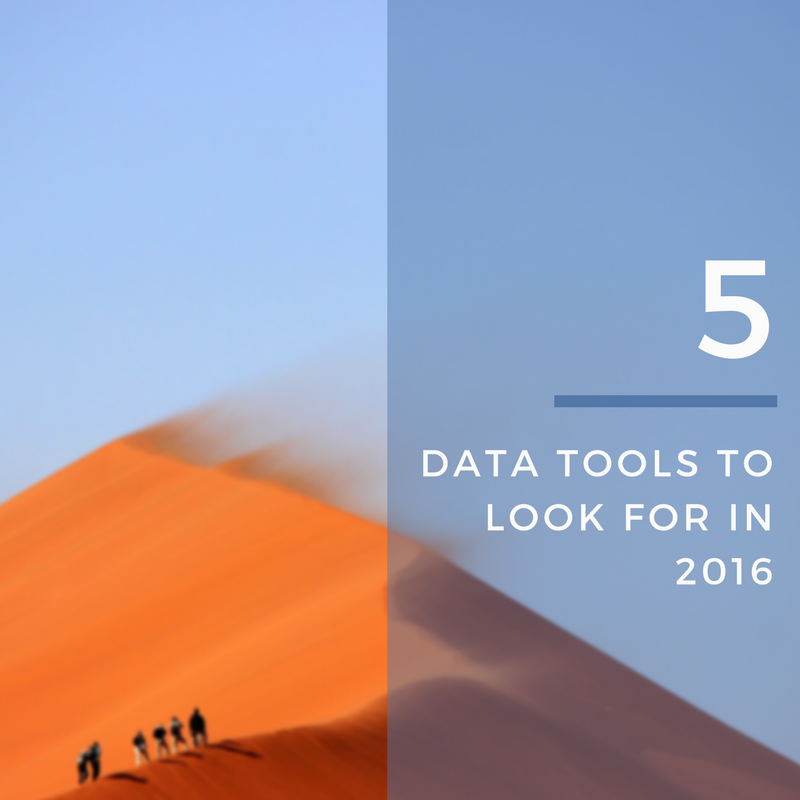
In early November, some of our Arkabots attended two very different conferences: our data vizzers went to the Tableau Conference, while our marketing team went to Inbound 2016. As a …
Read Storyby Pat Lapomarda, on November 17, 2016
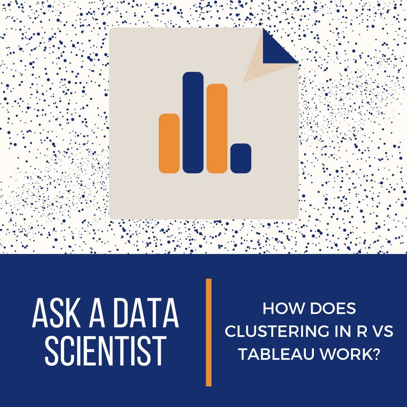
In the last installment of AADS, about the Top Algorithms Used by Data Scientists, I closed with a teaser: In the next installment of Ask a Data Scientist we will …
Read Storyby Katie Paige, on November 15, 2016
Wow. We are back in the office today, still reeling from excitement from our trip last week! What a week it was. Thank you Tableau for an amazing conference filled …
Read Storyby Chris Bond, on November 8, 2016
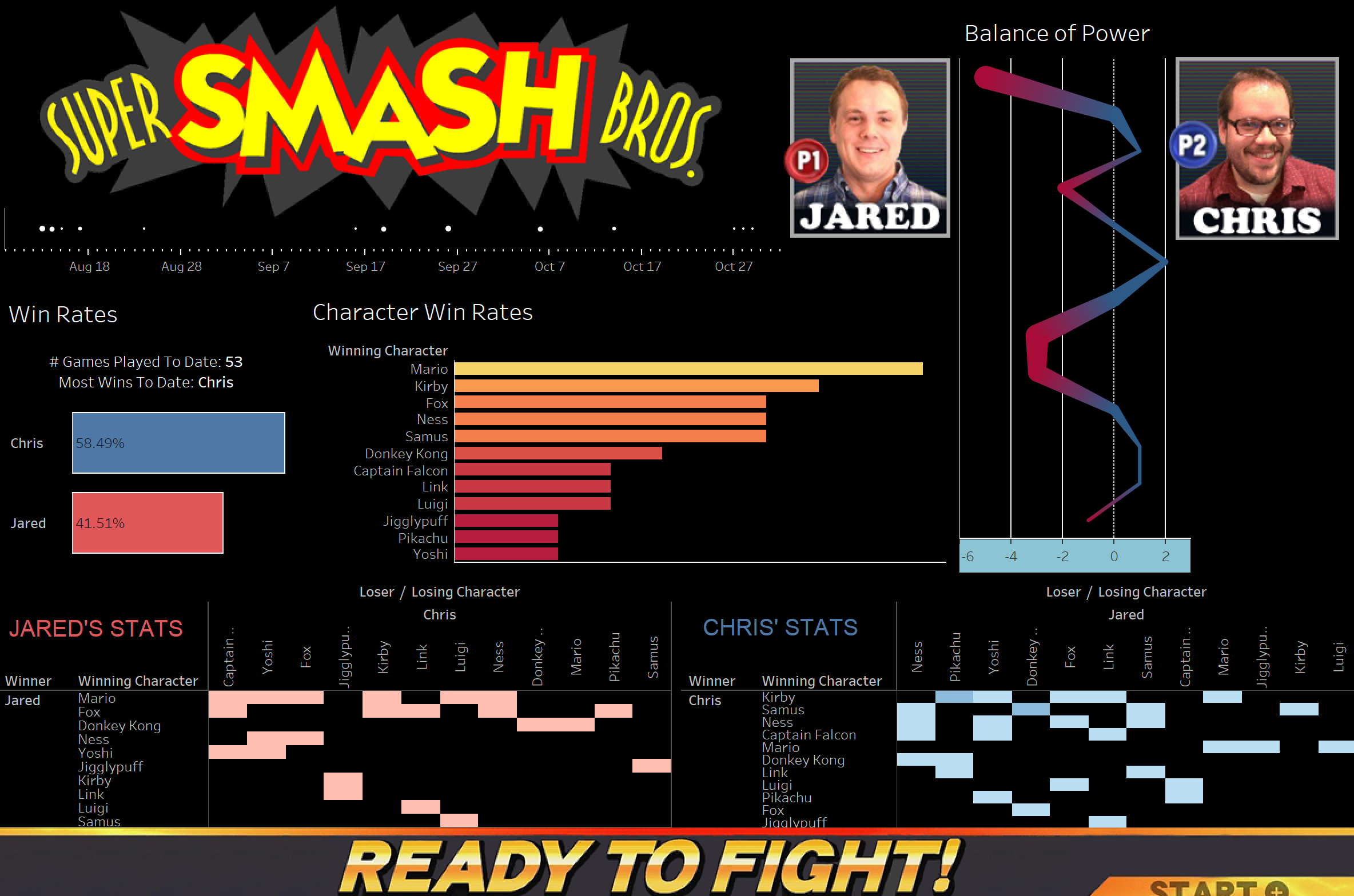
My roommate and coworker Jared had just grabbed a load of stuff for our new apartment from his parents house. Included in this carload was every 90s kid's dream machine: …
Read Story75 Washington Ave., Suite 2D
Portland, ME 04101

