


by Pat Lapomarda, on November 17, 2016

In the last installment of AADS, about the Top Algorithms Used by Data Scientists, I closed with a teaser:
In the next installment of Ask a Data Scientist we will compare two approaches; Tableau, the "new kid" on the clustering block, and R, a tried and true clustering stalwart. So, stay tuned, and thanks for reading!
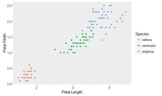
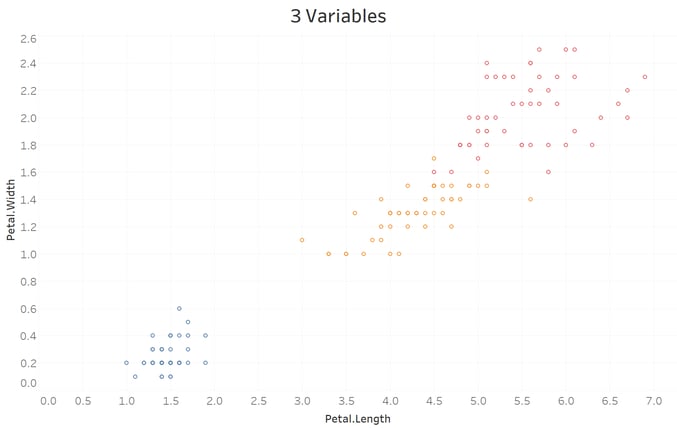
Ben Richey has been working with me on this. We decided that the best way to understand the inner workings of Tableau's clustering would be to use the classic Iris dataset, which you can get within R or from the Machine Learning Repository at the University of California, Irvine. We used this to understand how the implementation of k-means differs between R & Tableau by trying to match the actual species of irises using clustering on the petal & sepal lengths & widths. The species are clearly clustered when plotted by the petal length vs. width and this will be our comparison point:
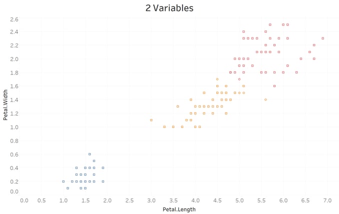
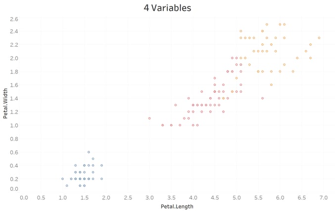
Boulder Insights published a nice YouTube tutorial on getting clustering going on the Iris data. There are four features to cluster on in the Iris data set: Petal Length, Petal Width, Sepal Length, and Sepal Width. The basic Petal Length vs Petal Width is the same in both:
R:
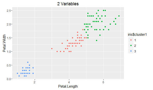
Tableau:
What's really interesting is that when you add more features (Sepal Width), the clusters start to diverge significantly:
R:
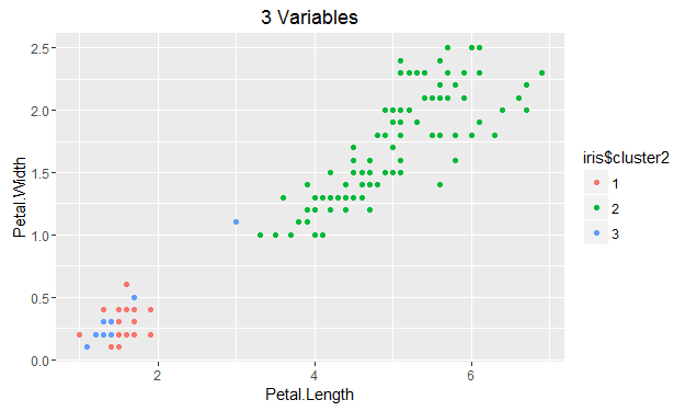
Tableau:
Finally, with the addition of the fourth feature, R stabilizes; however, if we change the random starting point, we can see its effect on cluster assignment:
R:
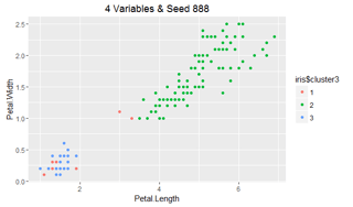
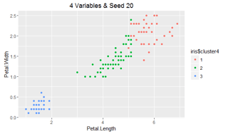
Tableau:
The drift between the two R versions has now become very noticeable, while Tableau is quite stable; however it's 2nd cluster has actually grown slightly with the addition of a fourth feature to the model. This difference between the two methods occurs because of several differences in technical implementation of k-means:
|
|
||
|---|---|---|
| Distance Measurement |
Euclidean only |
Euclidean only, but with alternative implementation (kmeans {amap}) Maximum, Manhattan, Canberra, Binary, Pearson , Correlation, Spearman, & Kendall are also available |
| Centroid Initialization |
Uses the Howard-Harris method to divide the original data into 2 parts, then repeats on the part with the highest distance variance until k is reached. Bora Beran from Tableau does a great job explaining this. |
Randomly (using set.seed) or Deterministically (using centers) picks k points define the clusters |
| Categorical Variable Use |
Built in transformation using Multiple Correspondence Analysis (MCA) to convert the category to a distance. |
Separate function for categorical data (kmodes) using mode vs. mean as measure or requires pre-processing to convert categories into numbers. FactoMineR is most popular. |
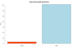
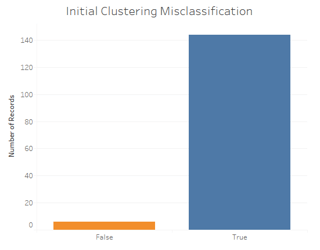
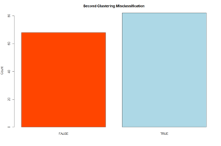
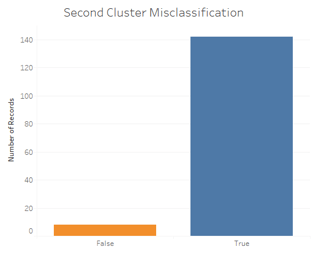
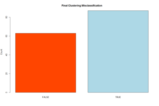
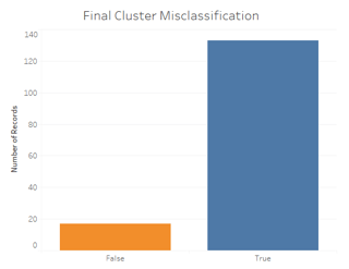
Tableau does a much better job matching the actual Iris species, regardless of the features clustered. Here is a comparison of their misclassification rates (R on the left, Tableau on the right):
Therefore, Tableau can really help speed up your analytics! Ready to test it out yourself? Check out our R markdown and Tableau workbook here:


Have a feature you'd like us to test? Need some data solution recommendations? Curious about the Data Science industry?