


by Kayle Simpson, on July 26, 2016
At Arkatechture, one of our specialties is Data Visualization, which often gets confused with Infographics, or Information Graphics. While all of these terms are similar and lmost the same (Data/Information, Visualization/Graphics) in practice they are all very bit different. A Data "Vizzer" will probably be very upset if you call their work an "Infographic." Confused? As someone who makes a lot of infographics, and now has a data visualization under her belt, let me explain the difference!
Data Visualizations Are Interactive
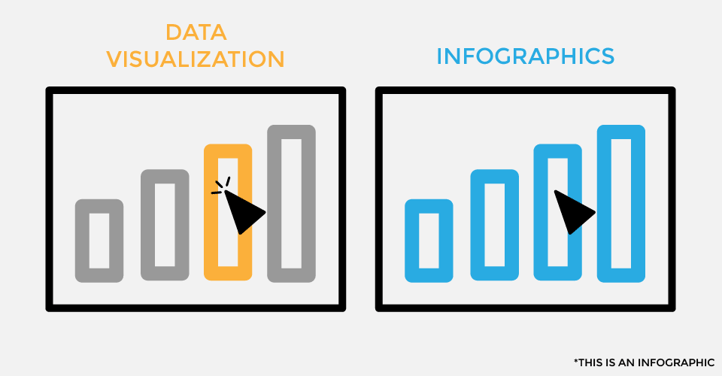
First and foremost, Data Visualizations are almost always interactive in some way. At Arkatechture, we primarily use Tableau for creating "Vizzes" which give our clients the power to filter different parameters, isolate specific data points, and search within their data. If someone says they're a Data Visualization specialist, they're probably familiar - if not an expert - with Tableau. Some other Data Visualization tools are Qlik, D3.js, and Chart.js.
Infographics are almost never interactive, and are usually image files. Infographics are typically made in programs like Illustrator or Canva.
Data Visualizations Are Quantitative
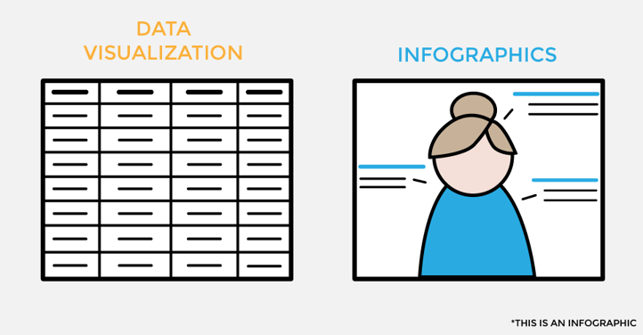
Secondly, Data Visualizations emphasize the quantitative - if a Data Viz doesn't have any numbers, it's not very insightful! The data for Data Vizzes is always from a spreadsheet or a large scale data source, like a Data Warehouse, which means those numbers can be constantly updated and changed.
Infographics, on the other hand, can include quantitative data - but is usually limited to singular, static numbers that cannot be changed. Infographics can also be exclusively qualitative, and still be considered an Infographic (like the images in this blog post!)
Data Visualizations Are For Business Intelligence
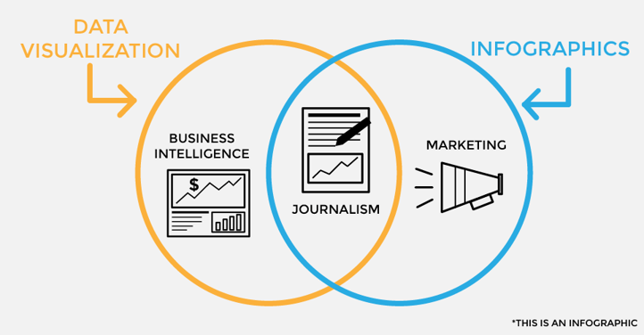
Lastly, Data Visualizations are primarily used for the purpose of Business Intelligence. You can read more about what BI is here! Basically, Data Visualizations are primarily used internally within businesses and organizations. The biggest exception to this is the Tableau Public Gallery - which is a public space where anyone posts their Vizzes made with Tableau. Vizzes with the intent for marketing, promotion, practice, or just for fun are all here!
In contrast, Infographics are used for marketing, branding, or promotion of some kind, and they don't even always have numbers in them. For example, here's an infographic I made for Arkatechture about all the different products Tableau offers! There aren't any numbers, and it's heavily stylized. However, it does communicate some kind of information and its intent is to teach the viewer something. You can usually find Infographics on social media, especially on Pinterest and Slideshare!
What About Journalism?
All of this said, there is a gray area between Data Visualizations for BI and Infographics for Marketing- Information Graphics for journalism. The people that make these graphics are called Information Graphics Designers or Data Journalists. These graphics can be static, dynamic, or interactive - which is why this is a gray area. Not sure what I'm talking about? Great examples can be found at FiveThirtyEight, PEW Research Center, and Wall Street Journal Graphics.