


by Darren Fishell, on May 6, 2020
 Check out the One Pager here
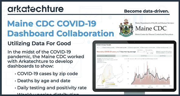
The following article is written by Darren Fishell, a Data Visualization Analyst here at Arkatechture. This project started as a personal effort by Darren in his free time,. Darren was then contacted by the Maine Center for Disease Control and Prevention which blossomed into a full development project between Arkatechture and the ME CDC.
The COVID-19 pandemic demonstrates the importance of data and the visualization of said data to communicate information to key stakeholders and the public.
The outbreak of the novel coronavirus has provided the world with a crash course in data visualization. News outlets, public health agencies and the public are all trying to develop descriptive charts to better understand the virus’ behavior.
I had the same impulse.
So, I spun up a very small serverless data pipeline to pull in data published daily by the Maine CDC, pushing it to Google Sheets and a Tableau Public dashboard.
That grew into a collaboration between the Maine CDC and Arkatechture, providing clear and accessible time series breakdowns of coronavirus cases segmented by geography, age and population-adjusted rates.
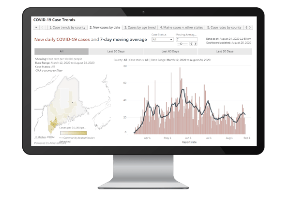
The dashboards track common trends in the spread of the virus in Maine, at the county level, and in consultation with the Maine CDC’s epidemiology team.
The dashboards extend the utility of the data that the CDC publishes daily, performing some analysis by calculating the new daily cases by county, share of cases by age group and rates of hospitalization and recovery.
For me, the project has reinforced two things, in particular: the power of data visualization and the benefits of an agile development approach. This global outbreak has challenged our social safety net, economy and health care systems. It has also challenged our communications networks, by which I don’t just mean fiber networks.
The challenge quickly became one of how to ingest and translate a wide array of data for a rapidly changing situation. This led to a number of creative visualization solutions. The New York Times front page of March 27 is a perfect example of data visualization for unprecedented times.
Data visualization has played an important role in the response to the crisis itself. The first chart to dominate the public health response showed the importance of “flattening the curve,” summarizing how slowing the spread of the virus could prevent overwhelming the national healthcare system.
As states and localities contemplate when and how to begin the slow process of opening back up, data visualization -- backed by epidemiology, statistics and data science -- will continue to play a key role in how we get through this situation together as a community.