


by Darren Fishell, on September 20, 2019
Tableau’s growing capacity for handling geospatial files got a big boost in their 2019.2 content release, including mapping changes that dramatically improve the user experience.
Last year, Tableau introduced the ability to join spatial files based on their location, but the maps lagged other best-of-breed mapping platforms, like Google Maps, until this year’s release with 2019.2.
The biggest mapping change is under the hood. Tableau now uses vector maps, which dramatically improves map scaling at different zoom levels.
The latest release also adds background map options that previously required connections to Mapbox -- familiar choices that include “streets,” “outdoor” and “satellite” basemap layers.
Combining Points and Polygons in Tableau
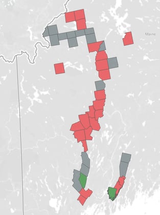
I’ve used these features to produce a quick illustration of a controversial power line project through Maine (also called Vacationland, but where we Arkabots work).
In this post, I’ll walk through how to quickly and flexibly produce a geospatial analysis in Tableau. First, here’s the viz we will recreate. I'll embed it here for reference, but you can view the entire workbook here on Tableau Public.
There are three elements here: two spatial files and a Google Sheet tracking towns that have either supported or opposed this power line project.
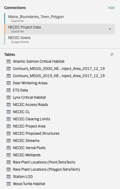
The spatial files
To start, I wanted to know which communities this project specifically touches. That’s a perfect question for a spatial join.
For this, we need a spatial file for the project components (points) and a spatial file showing municipal boundaries (polygons). Tableau will create a “Geometry” field for both data sources, which we’ll use for the join.
We’ll use the polygon file as the base for this analysis, since some of the places we want to include aren’t on the project path, so we want all municipalities in play in the source.
Both files can be imported by selecting “connect to data” in a new workbook and then hitting “spatial file.” Locate the files and they will become available in the data source pane.
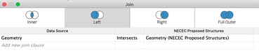
The point file (.kml) has multiple layers, which will show when we connect. The layer we want is “NECEC Proposed Structures.” You can drag that table onto the data import pane, doing a left join to the polygon file. Select “intersects” in the join criteria to perform the spatial join.
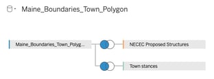
We can then bring in the third source, showing local opposition or support for the project, left joining that to the polygons file, too, matching on the town names. In this case, I conformed the town names in the Google Sheet to the style in the polygon shape file.
Vizzing with this new spatial source
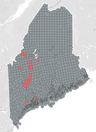
Now that we have all of the data that we need, let’s explore what we can do with the spatial files. First, let’s plot the base of our map: every municipality in Maine.
To do this, we’ll double click the Geometry field from the polygon file. That will bring in all of our polygons as one giant shape. We’ll want to break this shape up by town and then color it by support or opposition to the project.
To do this, drag the town dimension from the polygon file onto the Detail card. Then, drag the Oppose or Support dimension onto the color card.
This is helpful, but we have a little more information than we need, from all of the towns that are not involved.
We’ll need to filter out communities where the project won’t travel and where residents or local officials haven’t voiced an opinion.
The data tells us the answer here, with a simple calculation to test whether a record has a project structure or whether there is a support or opposition record. The field looks something like:
NOT ISNULL([Name]) OR NOT ISNULL([Oppose or Support])
I named this field “Voted or affected.” Drag the field to filters and set to “True.” The result is a corridor of only the relevant towns. To simplify, you can add this condition as a data source or extract filter since we won’t need them anywhere in the workbook.
Adding a second axis to view the project path
Now that we have all of the relevant communities, we want to see the actual path that this project will take. For that, we need to create a dual axis map, with the project geometry plotted on that second axis.
To do this, drag another instance of the Tableau-generated longitude measure onto the columns shelf, which will create another card for this measure and duplicate our map.
Now, we’ll want to change the detail used in the second plot, replacing the polygon Geometry field with the Geometry field from the points file. Then, remove the town and color detail.
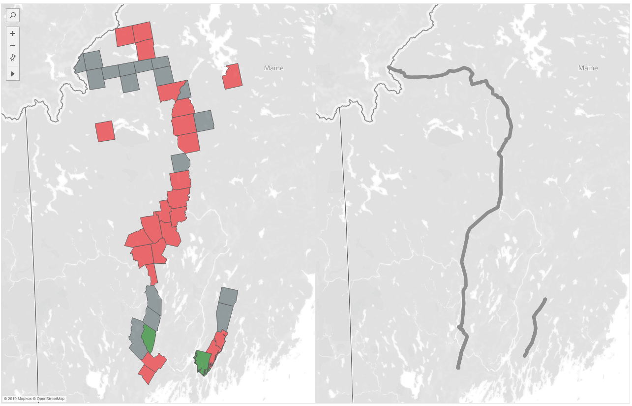
The result is our project path and color-coded municipality shapes in one worksheet. Now, right-click the second longitude dimension (for the points file) and select “Dual Axis” to merge these two maps.
Styling the project path
You can now change the border, color and styling of the project path to stand out against the other shapes. Or, adjust the opacity of both to make them visible alongside each other.
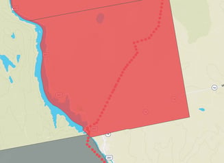 For more flexibility, change the style of the project path to “circle” and add the name of the structures to the detail pane. This will break out each individual point, which can then be scaled up and down in size.
The individual points will show when the user zooms, but the shape will -- in this case -- appear as a continuous path at higher zoom levels.
To customize the background map, click the Map menu, then “Map Layers.” In that menu, we can select various background maps and data layers such as place names and streets or building footprints, where available from Mapbox and OpenStreetMap.
For the final viz, I added a color-coded list of towns that users can click to highlight shapes on the map. That's it! You've made it, how does it look?
If you're looking for help with geospatial analysis in Tableau, reach out to us here at Arkatechture to learn more.