A Data Driven Website Redesign
by Kayle Simpson, on April 25, 2016
As you may or may not have noticed, our website was recently redesigned! It's definitely still a work in progress, but I personally believe that all websites should be constantly working to improve and change. And a lot of these changes and improvements are dependent on the analysis of site data!

My name is Kayle Simpson and I'm the Digital Marketing Manager at Arkatechture. I recently redesigned and relaunched our website - but I couldn't have done it without data! Being that data is what we do here at Arkatechture, it only seemed right. I always like to start my website redesigns with a website audit - ours looks a little like this:
While I could go on for hours about the qualitative information in this audit, like how a website is a sort of homebase for your branding and details about Arkatechture's tone of voice, but that's not what I'm here to talk about! I'm here to talk about our favorite topic at Arkatechture: data!
I gathered all of our website data from HubSpot - which is the platform our site is hosted on. While the set of statistics I used, our page views, was a pretty obvious choice - I came to a lot of conclusions just from this tiny set of numbers!
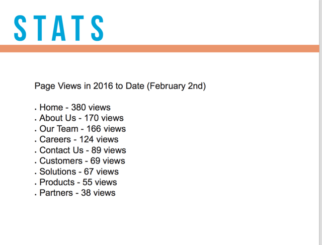
The home page naturally came in first, with nearly double the views as any other page. From this, I knew that we needed to put more information on our Home page - initially our homepage was very vague with unrelatable imagery. Above the fold, all we had was a stock image and a tagline. Now, we have an image we purchased of Portland, ME (our home!), a tagline and a little bit about ourself.
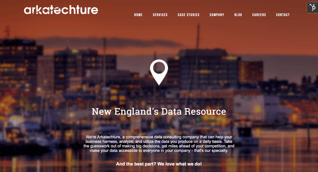
This gives viewers a better idea of what our personality is like, and looks much more inviting. The last thing about the homepage that I want to point out, is that there are more opportunities to explore and interact with the site. Our original homepage only had one clickable button that took you to the contact page. Now, we have image based links for our most recent case studies and blog posts, a native contact form, and a way to learn more about the company.
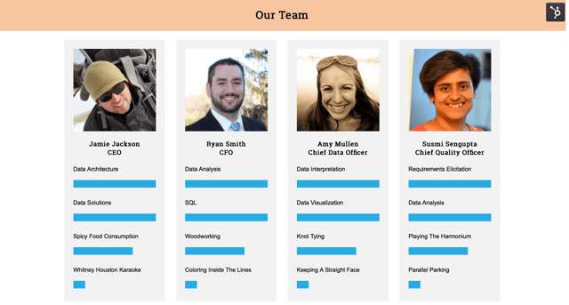
The next statistic I used was the second and third most visited pages - About Us and Our Team which tells me that visitors are interested in both in nearly equal numbers. I combined the two in our new Company page - which has both the story of our company, as well as information about our employees. I also thought it would be fun to make a chart of what everyone is good (and bad) at - which is what you see on the Company page now!
Lastly, I noticed that not nearly as many visitors were viewing our more detailed pages - like Partners, Products, Solutions, and Customers. While all of this information is very important and we want our viewers to get the messages we have about those things, the problem was in the delivery. We now have a very simple Services page (which alleviates the confusion between "Products" and "Solutions") and moved our partners to the footer. While our customer-base is a great marketing tool, our original page was a wall of logos that didn't tell us anything. So, we've converted our Customers page into our Case Studies page - which we will be updating monthly with real stories about our clients' successes with data!
Now, I got all of this from just one data set. Imagine how much more you could learn about your website, and any other marketing channels, if you had access to all of that data! If you want to learn more, check out our blog post about data warehouses and why your company needs one, or if you're ready to become a data rockstar - set up a consultation!


