


by Greg DiRobbio, on January 17, 2017
Have you ever been involved in a project to develop a dashboard that promises to answer everyone’s questions, takes months to develop, meets all requirements and then fails to be adopted? How does this happen? The great masterpiece you’ve spent the better part of a year developing is dead on arrival. It ends up collecting dust as users continue to fiddle with pivot tables and fall back to their old analysis methods.
It’s all too common that users don’t have a clear vision of what they want in a data visualization project. They end up including every data element and measurement they can think of because, “someone might need it at some point”. What are they looking to measure?, well… everything! How are they looking to segment it?…every way possible! Don’t be seduced by the idea that you can solve every need under the sun with a single dashboard or you may end up making a behemoth that is complicated to use, slow to perform and too broadly scoped to be widely adopted.

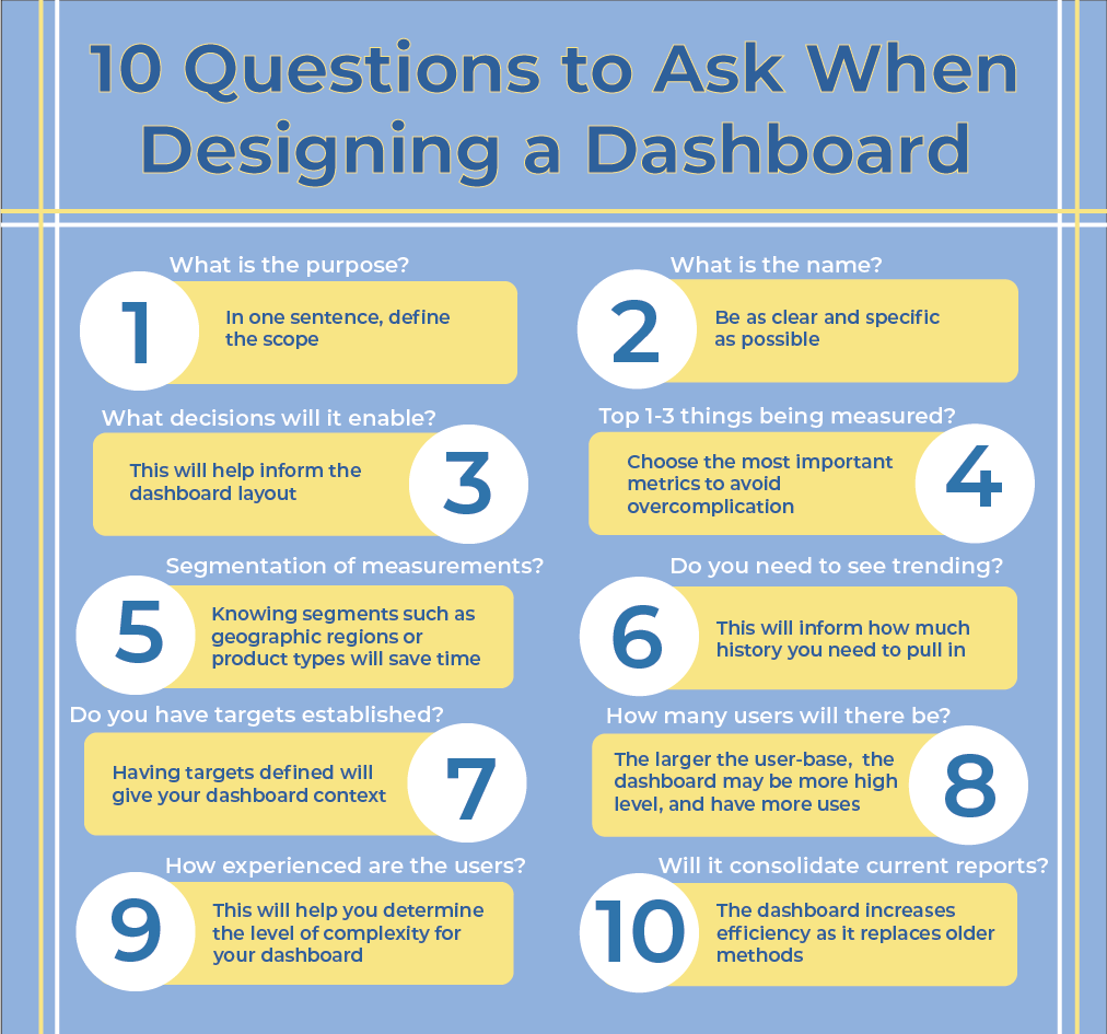
In my experience, the mostly widely adopted dashboards serve a single purpose, are rapidly prototyped, and evolve dynamically. When entering initial requirements gathering for a new dashboard, asking this list of 10 questions will help you to design for success by focusing the customer needs and providing you with the key information that you need to design for success.
These 10 questions are a great place to start:
1. In One Sentence, What is The Purpose of This Dashboard?
This should define the scope. All dashboards should have a single purpose. Don’t let scope creep destroy your project. If a user can’t succinctly describe what the dashboard will be used for in one sentence that probably aren’t going to use it.
2. What is The Name of The Dashboard?
Naming the dashboard right up front will help to solidify the purpose and begin the branding process. Try to be as specific as you can in naming the dashboard. The name should clearly describe the purpose. The purpose of a generically named dashboard will be ambiguous to users and may lead to confusion down the road as in “Why are there three Marketing Dashboards?”
3. What Decisions Will You Make Based on This Dashboard?
Analytics is all about making better decisions. This is the most important question! Just seeing results in a pretty picture does not add any real value. Understanding what decisions the dashboard will drive will help to inform you about the layout (guide them through the decision process) and it will put the customer in the right mindset for the next questions.
4. What Are The Top 1-3 Things That You Are Going to Measure?
A dashboard with 20 KPIs (Key Performance Indicators) is destined to be too complicated and will inevitably be too broad to provide real value. Limiting the number of metrics will aid in the simplicity of the design (less is more when it comes to dashboard design) as well as focusing the visualizations to provide specific actionable insights.

5. What Ways Do You Need to Segment These Measurements?
The segmentation that the customer provides in this initial meeting are going to be the most important. As time goes by they may want to add more, but inevitably this initial list informs you what they will be using the most. This is a good time to get an understanding of the hierarchies that you will be dealing with. Common examples are geographic regions, product types, and customers. Knowing these things in advance will save you time in the long run.
6. Do You Need to See Trending?
This refers to measurements over time. Year over year, month over month, trend lines etc. The answer to this question is usually yes, but discussing this up front will let you know, how much history you need to pull in, what date grain they have (daily, weekly, monthly etc.) and uncovers comments like, “we changed the way we recorded that measure in 2015 so a 2016 comparison to 2014 is not going to be accurate.” You can save yourself a lot of refactoring by knowing this information in advance.
7. Do You Have Targets For The Measurements Established?
Context around a number is critical to getting any meaning from it. A dashboard without targets needs to have some measure of good or bad. Start this conversation with the customer now because it will inevitably come up. If they do have targets, ask questions around where are they stored, who sets them, how often are they updated etc. Asking this question will guide you in determining what visual cues you will use and getting these answers up front may help you avoid some nasty data integration issues or timing issues down the road.
8. How Many Users Will This Dashboard Have?
This question serves multiple purposes. A dashboard with 500 users will likely have more high-level people that need provide input and will have a broader scope. Keep in mind that a larger user base may indicate that it will be used for multiple purposes. If one area is going to use it to measure the success of strategic initiatives while another area is going to use it for operational effectiveness you may be looking at two dashboards. Get this out in the open and start the discussion right up front. Figure out who are the key players are. Keeping these key players engaged and collecting their input will increase adoption. Figure out who the technical people are. Use them to push the dashboard to the extreme, find bugs, and test. They are very likely the go to people in their area for technical issues so having their buy in is critical to successful adoption.
9. How Sophisticated Are The Users?
In dashboard design simple is ideal. Sometimes based on the ask, dashboards inevitably become more complicated. Knowing the technical abilities of the user base will help you determine the appetite for the level of complexity. This will also give you an indication of how much training is needed at roll out. If you have a non-technical user base and a complicated dashboard adoption may suffer. And Finally..
10. Will This Sunset Reporting That Currently Exists?
Management loves this question. Being able to eliminate or consolidate current reporting, especially if that reporting includes manual effort to compile, can increase the value of the delivery. Whether there actually is something to sunset will depend on the maturity of the company and area you are working with. The #1 way to increase adoption is to remove alternatives.